Ever looked at bold graffiti letters and wondered how artists create those eye-catching designs? You’re about to find out.
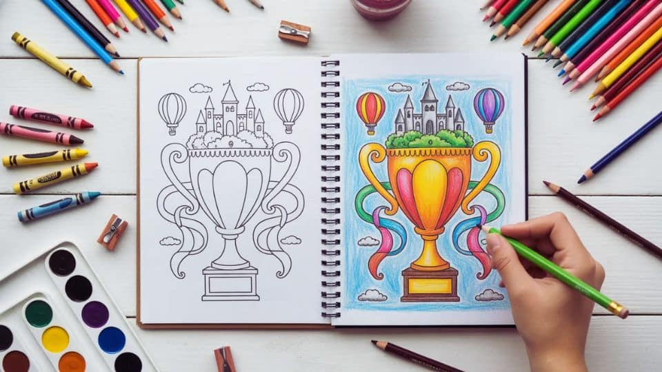
Graffiti drawing combines creative lettering, color, and personal style into art that truly stands out. And here’s the good news: anyone can learn it.
This guide walks you through everything from your first letter sketch to complete pieces with 3D effects. We’ve gathered the best video tutorials from experienced artists, simple exercises, and practical tips that pros use daily.
No experience? No problem. We focus on visual learning that makes sense from day one.
All you need is paper, pencils, markers, and a willingness to practice. Let’s get started.
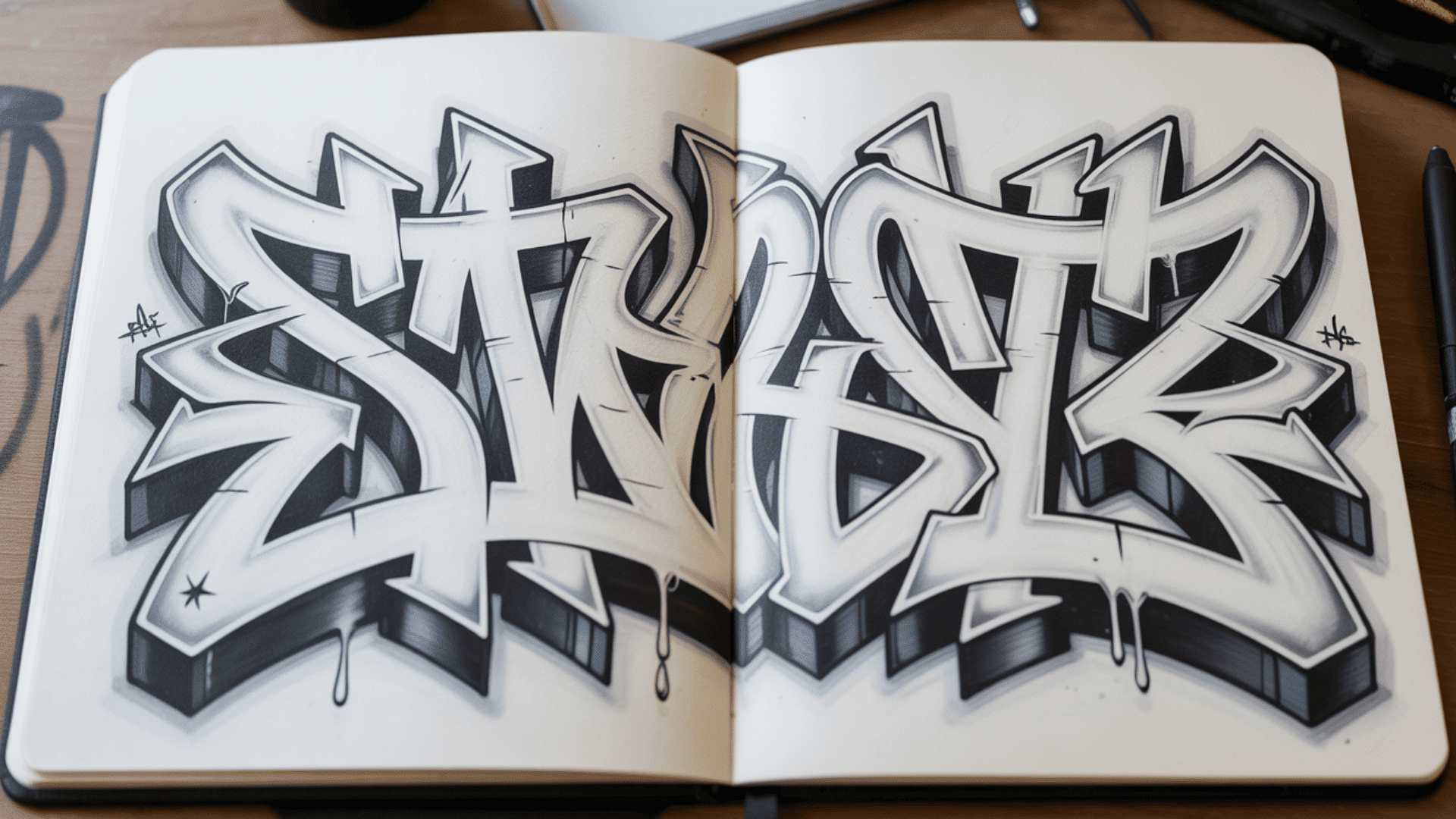
What Is Graffiti Drawing?
Graffiti drawing is the art of creating stylized letters that look bold and expressive. You start by sketching on paper, then add your own creative twist to make ordinary letters interesting.
Think of it as giving regular alphabet letters a complete makeover. You can make them bubble-like, sharp and angular, or flowing and connected.
What makes graffiti special is that it combines writing with visual art. You’re not just forming letters to spell words. You’re creating designs where the letters themselves become the artwork.
Most graffiti artists start by practicing on paper with pencils and markers. This lets you experiment freely, make mistakes, and find your style.
It’s a fun way to express yourself while learning real drawing skills.
Now that you understand what graffiti drawing is, let’s look at what supplies you’ll need to get started.
Tools and Materials You’ll Need to Make Graffiti

Starting your graffiti drawing practice doesn’t require expensive equipment. Here’s what professional artists recommend for beginners.
1. Essential Drawing Supplies
You’ll need a sketchbook or quality paper to work on. Look for paper that weighs at least 80 to 100 lb so markers won’t bleed through to the next page. Smooth finish paper works best with markers.
Many graffiti artists keep their sketches in a hardcover sketchbook to protect their work. Pro tip: Keep scrap paper between your pages when using markers to prevent bleed-through.
For your basic toolkit, grab these items:
- HB pencil for sketching and 2B for darker lines
- Pink pearl eraser (won’t damage paper)
- Fine liners 0.5mm to 0.7mm (Sakura Micron, Copic Multiliner, or Stabilo Point 88)
- Bold markers like Sharpie, Posca, or Montana for thick outlines
- Colored markers (Copic, Prismacolor, or Ohuhu)
- Ruler for clean lines and 3D effects
You don’t need every color to start. Just a few basic colors work fine for your first pieces.
2. Optional Digital Tools
Many artists now practice graffiti digitally before moving to traditional media. Procreate for iPad is an industry-standard app with pressure sensitivity that feels natural.
Adobe Illustrator works great for creating clean, scalable graffiti designs on your computer. Graffiti design apps like Graffiti Maker provide letter templates and style inspiration when you need ideas.
3. Important Safety Note
If you plan to use spray paint eventually, always practice in legal spaces with proper safety equipment. You’ll need a respirator mask, not just a dust mask, plus safety goggles, gloves, and good ventilation.
Never practice graffiti on private or public property without permission.
Starting on paper first lets you master letter structure and style without legal concerns or health risks. Most professional graffiti artists spend years developing their skills on paper before moving to walls.
Now that you have your supplies ready, let’s get into the step-by-step process of drawing your first graffiti letters.
Basic Graffiti Lettering: Step-by-Step Process
Follow these five steps to create your first graffiti piece. Practice each one before moving to the next level.
Step 1: Choose Your Word or Letter
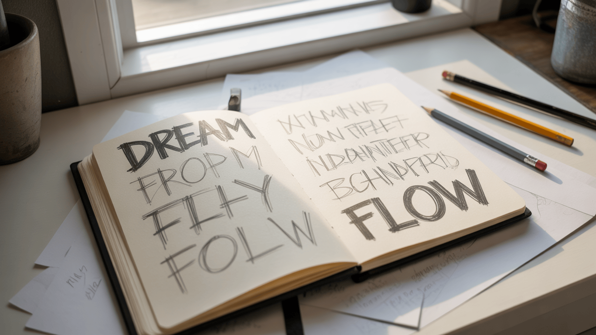
Start with a short word of 3 to 5 letters or your initials. Choose something meaningful to you, like your name, nickname, or words like DREAM, CREATE, or FLOW.
Short words help you focus on technique without getting overwhelmed. Your first word doesn’t have to be permanent, so experiment with different options.
Step 2: Sketch the Basic Shapes
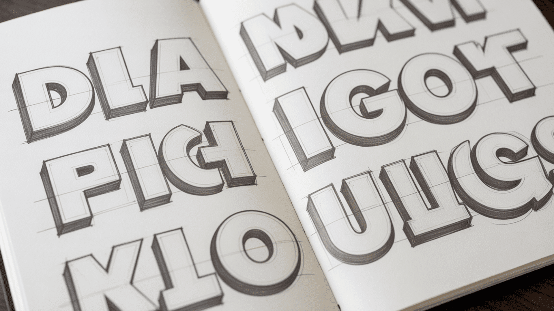
Start with block letters or bubble letters. These are the easiest foundations for beginners.
For block letters, write your word in simple capitals using light pencil strokes. Keep letters evenly spaced and the same height. Draw two horizontal guidelines to maintain consistent proportions.
For bubble letters, draw rounded, inflated versions of each letter. Make all edges curved with no sharp corners. Think balloons or puffy clouds.
Quick spacing tips:
- Letters with open sides (C, G, J) can overlap slightly
- Straight letters (I, L, T) need more spacing
- Rounded letters (O, Q, C) can nestle closer
This rough sketch should take only 2 to 3 minutes. Use very light pencil pressure since you’ll be refining these lines.
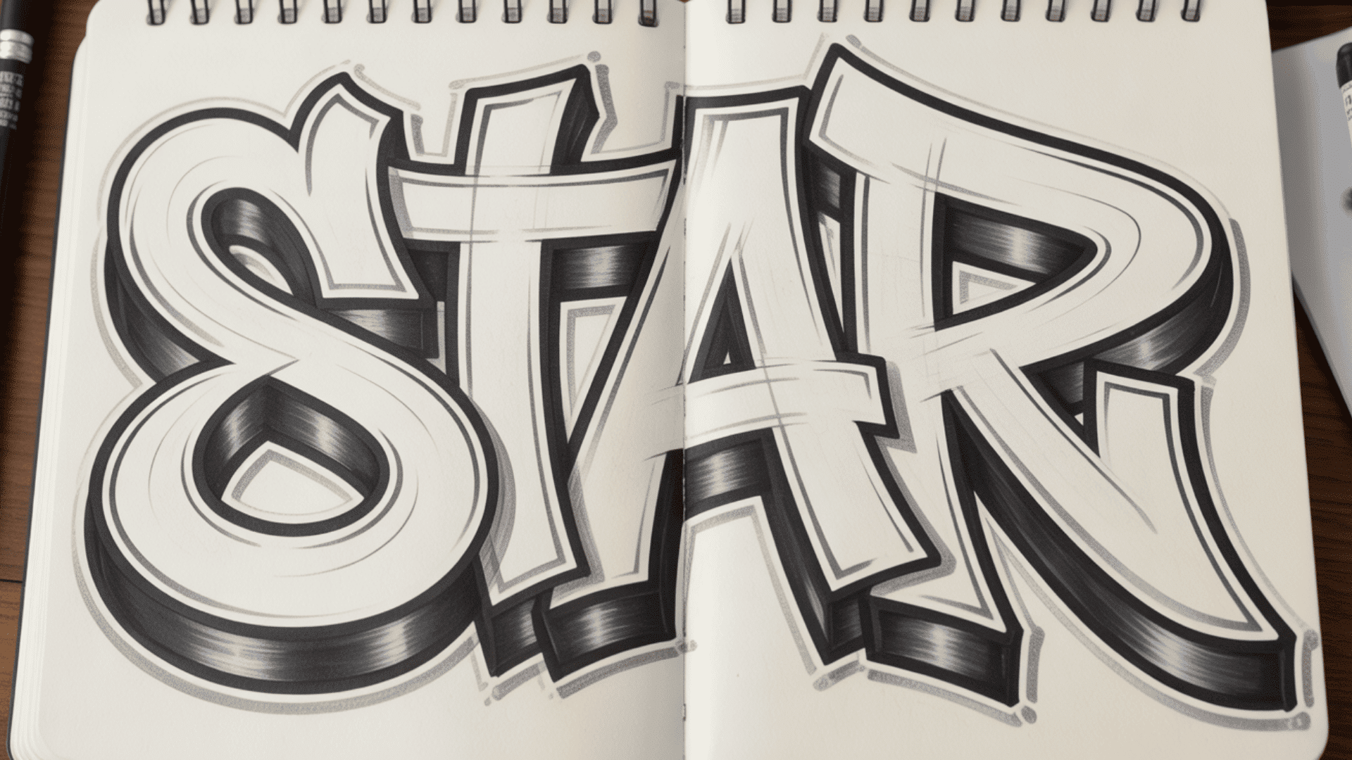
Step 3: Add Style and Character
Now transform your basic letters into stylized graffiti.
Extend lines by stretching strokes beyond their normal length. Add curves by replacing straight lines with flowing arcs. Create overlaps by making letters weave into each other.
Add weight variations by thickening certain parts while keeping others thin. Bottom-heavy letters create stability, top-heavy letters create tension.
Balance matters. If one letter has a thick bottom, keep that pattern consistent across all letters.
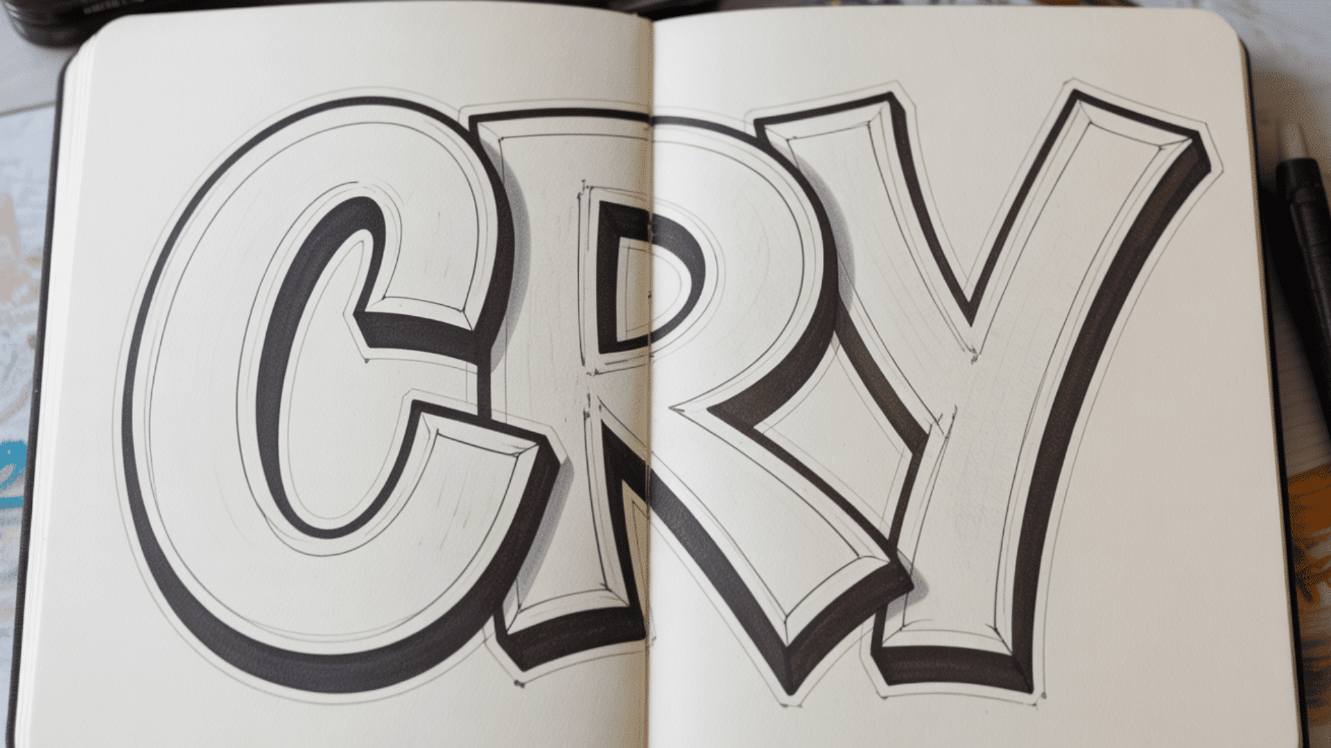
Step 4: Outline and Refine
Add a second outline around your letters, about 5 to 10mm from the original edge. This creates the bold look that makes graffiti letters pop.
Trace over your pencil lines with a fine liner or bold marker. Let the ink dry for 2 to 3 minutes, then erase all pencil marks.
Go back and thicken certain sections, typically the bottoms of letters or where letters connect. This adds visual weight and makes your piece more dynamic.
Step 5: Add Color, Shadows, and Effects
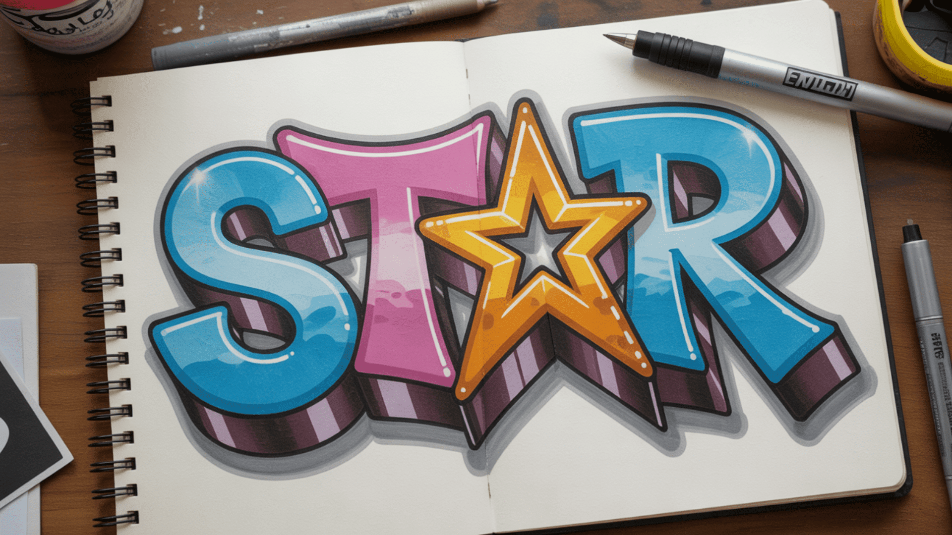
Stick to 2 to 3 colors maximum. More colors often create visual chaos.
Try these color approaches:
- Monochromatic: Different shades of one color
- Complementary: Opposite colors like purple and yellow
- Analogous: Colors next to each other, like blue and green
For shadows, choose a light source direction (usually top-right) and draw a shadow on the opposite side. Offset it 5 to 10mm from your letter.
For 3D blocks, pick a vanishing point and draw lines from each corner toward it. Make them 1 to 2cm long, then connect the ends. Fill with a contrasting color.
Add highlights with white dots or lines where light would hit. Place them opposite to shadows.
Keep effects simple. One or two special touches work better than overdoing it.
Video Tutorials to Follow Along
Video tutorials provide visual guidance that makes learning easier. Here are the top resources for beginners.
For traditional drawing on paper, watch this step-by-step graffiti tutorial that covers the complete process from sketch to finish. The video walks you through choosing your word, sketching basic shapes, adding style, creating outlines, and applying color effects.
You’ll see exactly how to hold your markers and build up layers for professional-looking results.
Video Credits: @Tinyygee
If you prefer digital art, check out this Procreate graffiti tutorial for iPad users. This tutorial demonstrates how to use Procreate’s brushes and layers to create graffiti letters digitally.
You’ll learn brush settings, color blending techniques, and how to add shadows and highlights using digital tools. It’s perfect for practicing without using up physical supplies.
Video Credits: @JamesJulier-Artist
Pro tip: Watch the full video first, then pause and practice each step. Repeat the tutorial 3 to 5 times to build muscle memory.
With these five steps mastered, you’re ready to explore more advanced techniques.
Advanced Techniques
Once you’re comfortable with basic graffiti letters, these techniques will take your work to the next level.
1. Adding 3D Effect and Perspective
Advanced block shadows use perspective principles to create realistic depth. All lines converge to one or two vanishing points, and blocks closer to the vanishing point appear smaller.
Shade within blocks to create volume. Areas farther from the light source should be darker.
Isometric 3D is another approach where letters pop forward without a vanishing point. This creates a more geometric, architectural look that’s easier to control.
2. Basics of Wildstyle Graffiti and Complexity
Wildstyle is the most complex form of graffiti lettering. Letters weave over and under each other with multiple arrows and directional elements.
Start wildstyle only after mastering simpler styles first. Professional artist Sotepniques notes that wildstyle is a language you build over time. Each artist develops their own vocabulary of shapes and connections.
Wildstyle features include:
- Interlocking letters that cross each other
- Arrows and bits (small decorative elements)
- Curves and straight lines working together
- Often challenging to read but visually impressive
3. Fun Details: Arrows, Drips, Stars
Small decorative elements add personality to your pieces. Drips at the bottom of letters mimic spray paint running. Stars and sparkles create energy around your letters.
Arrows add directional flow and can connect different parts of your composition. Keep these details minimal so they enhance rather than overwhelm your letters.
4. Tips for Experimenting With Styles
Study artists whose work you like and identify specific elements that attract you. Is it their curve style, color choices, or 3D approach?
Practice the same word 100 times with variations. By sketch 100, your authentic style begins to emerge naturally.
Combine elements from different artists in new ways, but always add your own twist. This is how you develop a signature style that’s recognizably yours.
Practice Exercises
Consistent practice builds skills faster than sporadic sessions. Here’s a structured approach to developing your graffiti drawing abilities.
Daily 15-Minute Practice Plan
Follow this 3-week plan to build your graffiti skills systematically.
| Week | Focus | Daily Exercises |
|---|---|---|
| Week 1 | Letter Foundations | Draw alphabet in block letters • Draw alphabet in bubble letters • Practice 5 letter variations • Draw your name 10 ways in each style • Combine best elements |
| Week 2 | Adding Style | Extend lines on 10 letters • Add curves to straight letters • Create interlocking letters • Draw 4-letter words with flow • Practice double-line outlines |
| Week 3 | Color and Effects | Blend color gradients • Try different fill patterns • Add drop shadows • Create 3D blocks • Complete full pieces with all effects |
Each exercise takes just 15 minutes. Consistency matters more than perfection
Skill-Building Challenges
The 30-Day Alphabet Challenge has you draw one letter per day for 30 days. For each letter, create a basic block version, bubble version, stylized version, and full color version.
Post on social media with #30DayGraffitiChallenge to find others doing the same challenge.
The Speed Challenge sets timers for different lengths:
- 5 minutes: Complete a tag
- 10 minutes: Finish a throw-up
- 30 minutes: Create a simple piece
- 1 hour: Build a complex piece with effects
The Evolution Challenge tracks your progress. Draw your name in week 1 as a complete beginner. Draw it again at week 4, week 8, and week 12. You’ll see clear improvement over time.
Even with practice, you’ll make mistakes. Let’s look at the most common ones and how to avoid them.
Common Mistakes (And How to Fix Them)
Even experienced artists make these mistakes. Here’s how to identify and correct them.
- Starting Too Complex: Beginners try wildstyle immediately and get frustrated. Master bubble and block letters first. Spend 2 to 3 weeks on basics before advancing.
- Poor Letter Structure: Letters look wobbly or inconsistent. Always use guidelines for baseline and cap line to maintain consistent proportions.
- Ignoring Negative Space: Letters feel cluttered when spacing is ignored. Step back frequently and ensure spaces between letters create balanced shapes.
- Using Too Many Colors: More colors create chaos, not impact. Stick to 2 to 3 colors plus black or white for outlines.
- Weak Outlines: Thin or shaky outlines look unprofessional. Thicken strategic areas like letter bottoms and connections after your initial outline.
- Inconsistent Light Source: Random shadows and highlights look wrong. Choose one light source direction and keep all shadows and highlights consistent.
- Skipping the Sketch Phase: Drawing directly with markers leads to uncorrectable mistakes. Always sketch first, even for quick tags.
- Not Practicing Tags: Neglecting tags limits your foundation. Practice tags daily as they’re the basis of all graffiti styles.
Learning from experienced artists can help you avoid these mistakes and develop your skills faster.
Conclusion
You now have everything you need to start drawing graffiti. From understanding basic letter forms to adding color and 3D effects, these techniques will help you create impressive pieces.
Remember that graffiti is about personal expression. Your style will develop naturally as you practice. Start with simple bubble or block letters, then gradually add more complexity as your confidence grows.
The key to improvement is consistent practice. Even 15 minutes daily makes a huge difference. Don’t worry about perfection in your early pieces. Every professional artist started exactly where you are now.
Grab your paper and pencils today. Choose a simple word and sketch your first piece using the five-step process.
Your graffiti style is waiting to be created. Start drawing, keep practicing, and watch your skills grow.
Frequently Asked Questions
What is Rule 1 of Graffiti?
The first rule of graffiti is respect. Don’t copy another artist’s style directly, don’t paint over someone else’s work without permission, and always develop your own unique style through practice.
Is It Illegal to Draw Graffiti?
Drawing graffiti on paper is completely legal. Spray painting on walls or property without the owner’s permission is illegal in most places and can result in fines or criminal charges. Always practice on legal walls or your own property.